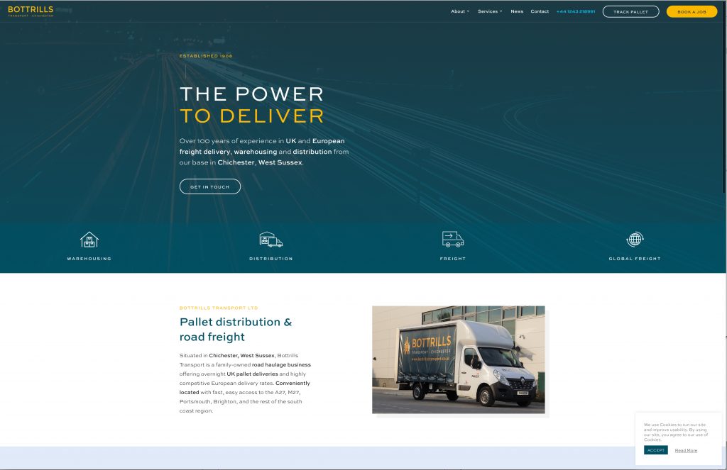
08/10/20Bottrills Transport Chichester Website Design


Profile design just launched this Bottrills Transport Chichester website design.
The website design and build by Alex Stanhope is to the usual high standard. Firstly, the WordPress based site features good attention to the detail, for example the typography, the layout and the function. As a result the site delivers a striking, user friendly experience. Secondly, because good coding, functionality and good design makes the foundation for a great site build.
Bottrills Chichester
Bottrills Transport in Chichester commissioned us for the company website in August. Importantly, we finished the website build within a 6 week timeframe. Moreover, Profile had already developed the company logo and branding so quickly applied the existing brand format to the new website.
Situated in Chichester, West Sussex, Bottrills Transport is a family-owned haulage business with an impressive history. Part of the history is outlined on the new website. AE Parker (now Parkers of Chichester), was the parent company to Bottrills Transport until the late 1970’s when the company fell dormant.
In 2018 Bottrills Transport Ltd was reformed and in 2019 became a shareholder member of the Pall-Ex Group.
Profile Design enjoy a good working relationship with both Parkers of Chichester and more recently Bottrills Transport.
Website structure
The new website has sections that cover the core of the business: Warehousing, Road Freight, Palletised Deliveries and European delivery.
A news blog with the usual social media links has been added. The site features a client area where jobs can be booked and tracked.
Good Website Design
Keeping it simple is a good basis for effective site design. Users are often not fussed about the design, they are usually more focussed on finding the information they want.
It is important for a site to include white space. It makes it easier for users to quickly find what they want without overload. Visitors will often just scan a page to find what they want – space helps them do that.
It is good to give the user a clear structure. Screen layout and navigation are important tools. The most important elements should be easily found.
Readability, typography and color use are important.
Keep typeface use to below 3 types in 3 sizes and a maximum of 20 words per line of text.
Comments