23/03/16Brochure design, Sadlers Warehouse, Chichester


We have been working on a range of design proposals for a brochure design for this prestigious new development in central Chichester. The building itself has immense character and history and the interior design and architecture are of the highest quality. The client wanted a brochure that was a bit different from the norm, so we spent considerable time researching what finishes and formats were available and suited this project and obtaining samples from suppliers around the country.
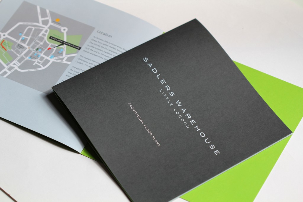
We are currently completing the design and artwork of the main brochure, there is a separate brochure for the floor plans (shown) both will be housed in a bespoke bonded board pocket folder, with a grain embossing and embossed silver foil for the logo. Creating a bonded cover involves selecting 2 complimentary coloured paper/board stocks and having them laminated together, this creates a very solid board and because you are using coloured material rather than printing colour onto an existing stock you achieve a completely flat colour. For this particular client we have used a charcoal grey and a bright green to match the company’s corporate colours.
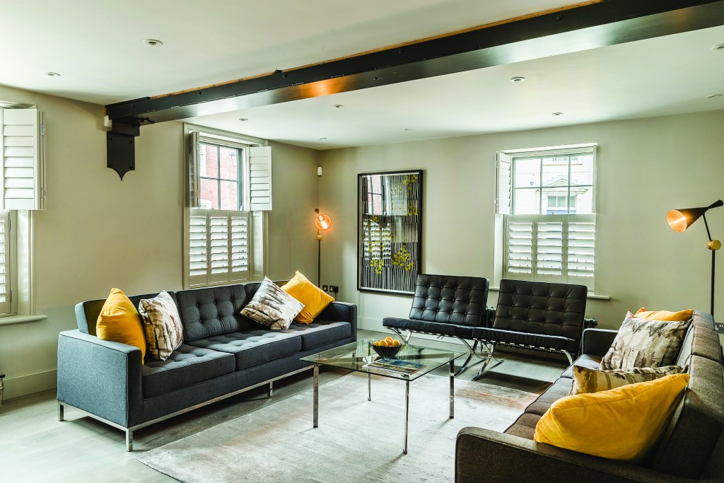
A development of this quality only needs great images and a classic but simple design to sell it. We will post images of the complete brochure package once printed.
Comments