01/09/22Car Graphic design

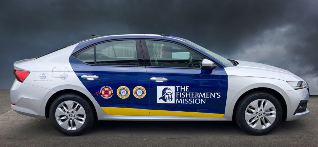
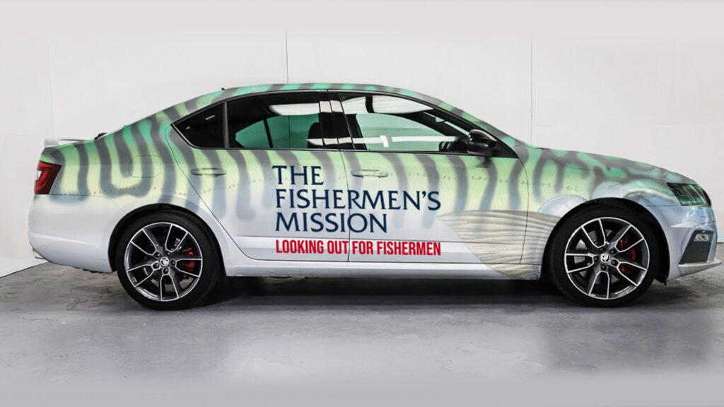
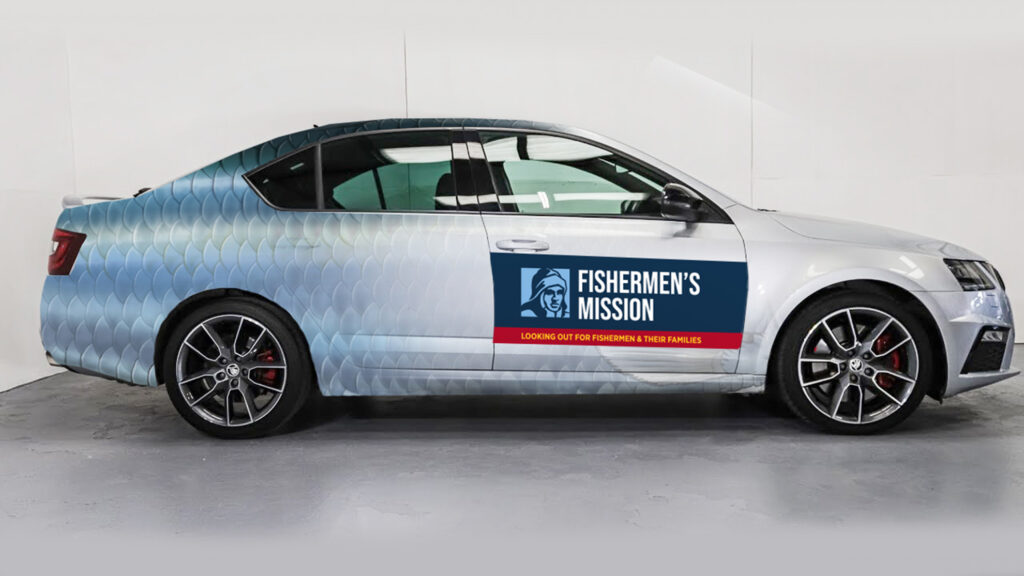
Recently completed were these design proposals for car graphic design for Fishermens Mission.
Profile design were given an open brief for this project. The re-design of the livery went through several sets of proposals. Apart from the standard use of the charity brand colours (Blue/Yellow/Red) we also explored the use of other textures.


Some of our proposals featured the use of fish skin patterns. These playful designs worked well as the base colour of the charities cars is silver. Although these designs raised a smile and were the preference of many it was decided that the best option was the stronger colours of existing branding.
Design Considerations
One of the considerations for the design process was the need to include a number of supporter logos. as well as these 4 logos we needed to include 2 call to action logos. These featured QR code links to relevant webpages for donation or more information.
Comments