25/03/21Direct Mail Design

Chichester Direct Mail Design
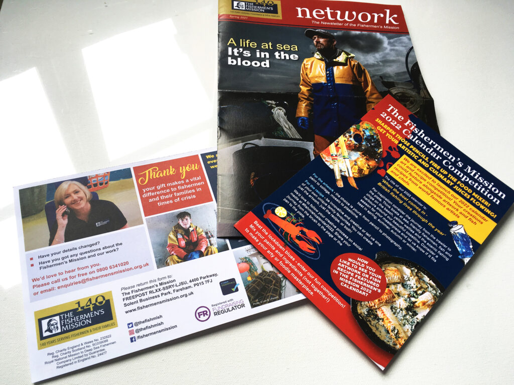
Just delivered is the latest direct mail design appeal for The Fishermen’s Mission charity. The resulting mailshot includes an 8 page A4 Newsletter which is folded to A5. Also included is a competition flyer and cover letter and gift form complete with reply paid envelope.
The Charity
The Fishermen’s Mission is celebrating it’s 140th anniversary this year. To celebrate and promote this we were asked to produce design options for a commemorative logo. The resulting logo is included on the items within this mailing.
Direct Mail Design Specialists
Profile Design undertake the Design of all the materials for the mailing of the Fishermen’s Mission appeal. Profile also manage the printing and mailing administration and despatch. The appeal mailing always has a set drop date target, this is usually met but the last few mailings have been adversly affected by Covid 19’s effects on the mail service and staffing levels at the mailing house. We look forward to services hopefully returning to something like ‘normal’ during 2021!
Considerations
Audiences interact with direct mail differently than to other digital media. 80% of people read or scan read their post. Only 20% of all campaign emails get opened. Direct mail increases chance of making an impact and getting a response.
Effective direct mail campaigns start with the best practices. Like any piece of marketing material, you need a complete, well designed package — a great looking design, effective copywriting, and an enticing invitation.
Clarity in Message & Design
Like any marketing campaign, direct mail campaigns are only effective when you have a clear message. It doesn’t matter how nice your direct mail design is. Your message needs to be poignant but powerful. If you are mailing the right people, your offer should catch their eye and move them to action.
Direct mail produces stronger and more reliable responses than other marketing avenues. Therefore include emotion and appeal in the design and copy to increase response.
Keep It Simple
Keep things simple in all aspects of your mailing. Crowding design with images or text can make it hard to read and confusing. Likewise, an offer that requires complicated steps to respond to is not good. Make sure that any actions that you are asking for are easy to respond to.
Comments