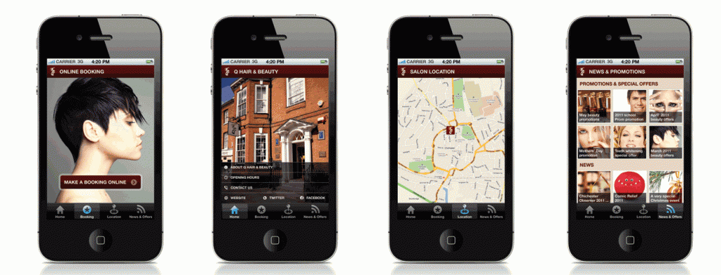
17/08/11iPhone app for Q Hair & Beauty

iphone App design
Work is almost complete on the new iphone app for Q hair in Chichester.
The App will be a formidable marketing tool for Q as well as being a convenient way for clients to book and catch up with the latest news and offers. Alex Stanhope who designed the app noted:
“Having worked in partnership with Q Hair & Beauty for some time now to produce their digital and print design collateral, we have always been impressed by their forward thinking and enthusiasm when it comes to marketing the business.”
“We love the fact that Q are committed to demonstrating that mobile applications covering this sector aren’t just the sole preserve of the major salon chains, and that independents can offer valuable services to customers via their smartphone and tablet devices too.”
“We are very much enjoying collaborating with the client to produce an iPhone app with a range of useful features, and can’t wait to see it debut on the App Store!”
The Q Hair & Beauty iPhone app is scheduled for launch in autumn 2011.
Golden Rules
Just because you have less screen space the rules of good interaction design still apply.
The main pillars of design are listed here:
- Goal-driven Design: You want to design for the right user. User research, such as surveys and interviews, will help you create personas for those most likely to use your app. This allows you to create specific goals for your users and tailor your app’s workflow to suit their needs.
- Usability: This seems like a no-brainer, but your app has to be usable. If your audience can’t easily use the app, then they certainly won’t download it from the App Store. Usability makes a product useful, which is the first step in being desirable.
- Affordance & Signifiers: The affordance is the function. Signifiers hint at affordance. For example, blue, underlined text indicates that clicking on it will take you elsewhere. Use signifiers correctly so users don’t need to think about what each UI element does.
- Learnability: You want users to instinctively know how to use an interface. This is where design patterns come in handy, which we’ll talk about later in the article. Familiar patterns help a new user easily acclimate to an app.
- Feedback & Response Time: Feedback lets users know if a task was completed or not. It can be as simple as a beep, or more complex like a modal window. Make sure your feedback is friendly, human, and responds within the guidelines.
Comments