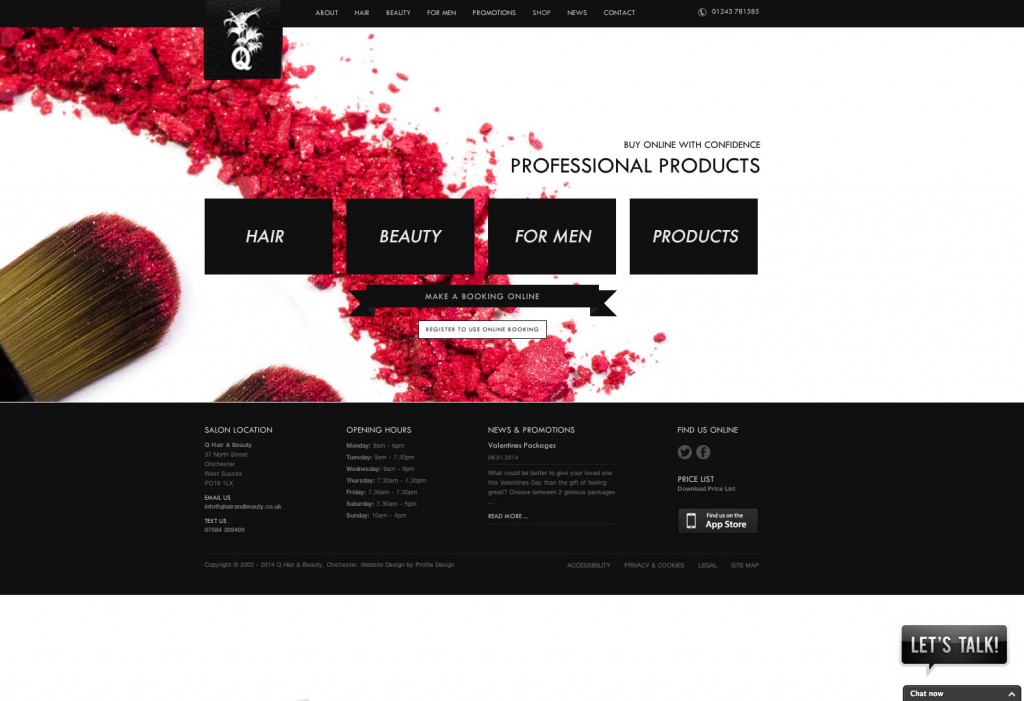
23/08/10New website for Q Hair & Beauty

New Website
New website forChichester-based salon just completed, Q Hair & Beauty, was one of the first businesses in the industry to embrace the possibilities offered by the then nascent World Wide Web, launching their first Website to great acclaim a number of years ago now.
However, things move fast online, and after many years of stalwart service, the decision was taken in early 2010 to radically overhaul the Q Hair & Beauty website, with a view to completely modernising and updating its presentation as well as installing a CMS (Content Management System) to allow staff members to update the content with ease.
In short, the brief was simple: to further improve the visibility of the business in a crowded marketplace both locally and beyond, and reinforce the notion of the superb quality of the hairdressing and beauty treatments on offer.
After presenting a concept design which outlined a tantalising visual direction in which the redevelopment process could be taken potentially, Chichester design agency, Profile, were commissioned to undertake the project, and so work commenced in earnest in the late Spring of 2010.
Taking the first steps with the design
The first step was to “work up” the initial concept layout to present a fresh, clean design that reflected the “classic with a twist” environment of Q’s stunning premises; an imposing four storey Georgian listed building, which has been lovingly restored to showcase many of its period features, as well as a whole host of very modern additions which have been specifically chosen to blend seamlessly with the existing surroundings.
To Profile’s Alex Stanhope, who had been tasked with leading the development process, it quickly became apparent that merely subscribing to “bleeding edge” trends in terms of the aesthetics might not be the way to go, and instead opted for an approach that while bang up-to-the-minute in many respects, could potentially age a bit more gracefully than some of the younger pretenders out there, and reflect the highly individualistic nature of the Q brand.
Once the concept design had been signed off – on the first submission no less – the emphasis shifted to converting it into a set of working Web pages and installing the Content Management System that would “power” the entire site. The watchwords here were usability and accessibility, and Profile opted to base the site around the popular, and in the right hands, extremely powerful WordPress system. Soon things started really coming to life with the original Photoshop-based designs being converted to modern, semantic XHTML and CSS “markup” (for those that don’t know, these are the bedrock languages of Website design).
Providing our client with advanced technology
Things progressed well, with the addition of many exciting features, such as a “double opt-in” e-newsletter signup system, anti-spam contact form, integration of Google Maps, and the addition of many cutting-edge effects through the use of advanced JavaScript and CSS3 coding. The opportunity was also taken to integrate the site with the online bookings system offered by the industry-leading “i-salon” appointment and Point-of-Sale management package from Integrity Software.
Also, as this is 2010, it seemed natural to set up a Twitter account so that news of the latest offers and events could be broadcast to a wider audience. Links were then set up on every page of the site to present links to Q’s Social Networking presence, including the already established (and increasingly popular) Facebook page.
As is well known in the industry, image really is everything, and it was decided that new interior photography should be carried out of the salon to show it off at its best; Alex Stanhope and Pete Hamilton from Profile duly did the proverbial honours, generating a number of fantastic images in the process.
The site – http://qhairandbeauty.co.uk – went live on 28th May 2010, and was quickly picked up and featured by a number of important design “showcases” online whose editors were very keen on the quality of its “look and feel” and this in turn translated to a hefty “spike” in traffic with over 10,000 page views in the subsequent 2 week period. Q is incredibly proud of the fact that the design “gurus” out there have taken such a shine to the brand-new site!
Comments